As of today, I have written approximately 762,000 words of fiction. That sounds like a lot unless you know that my goal in October of 2011 — before I even finished writing A Gift of Ghosts — was to write a million words, then decide if I wanted to be a writer. Having written approximately 200,000 words of fanfiction in the preceding twelve months, it didn’t seem unrealistic.
Oh, well.
As I said several months ago, I don’t need to finish those words to know that I’m going to be a writer.
But I’m not just a writer: I’m also a publisher.
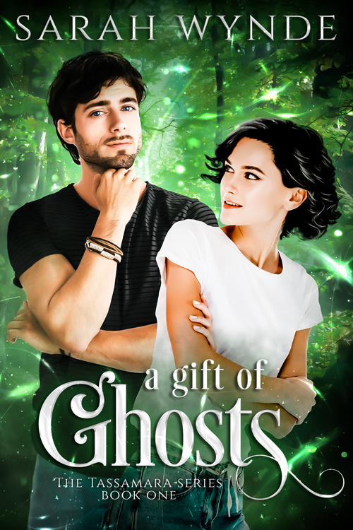
And one of the best parts of being a publisher is getting to look at the covers of your books and say, “Hmm, I think I’m ready for something new.” I tried updating the typography on the Tassamara series, thinking that would satisfy me, but it didn’t, so last month, I hired Kelley York of Sleepy Fox Studio and described my dream cover of A Gift of Ghosts to her.
Without further ado, my ‘something new’.

What do you think? Does it match your ideas of the characters? Would it be your dream cover? I haven’t updated the book yet, because I’m waiting until I have new covers for all the books in the series, but I couldn’t wait to share it!
Yes, that totally works for me!!!
I immediately saw these two as Akira and Zane. I can’t wait to see the rest.
🙂
I kind of like it … but it doesn’t resonate with me the way the victorian house does. Old houses just have a ‘vibe’ to them that says ‘ghosts might live here.’ But for the story about Grace and Noah this cover is spot on. Just another thought … wondering if a faded image of the General Directions building might be added to the background. I visualize it as it would have been when Noah and Grace were doing the stare-down with the bear in the woods. There, but not predominant to the scene.
Grace and Noah?! But… well, I guess we all create our own ideas of what characters look like! These models are definitely not Grace and Noah to me, however. As for the house, I liked it for a long time, too. I can always go back to it someday, if I get tired of this one!
They each look even younger than how I envisioned them, but I could get used to that picture.
Mid-twenties is looking pretty young to me these days, but that’s also a consequence of the illustration style, I think. Everyone looks younger when their skin is perfect. The funny thing about stock photos, though, is that all the men (on deposit photo, at least) have facial hair. ALL of them. Search on “clean-shaven” and you get pictures of men with full beards. So weird.
I like the house image better. But I never liked redesigned covers that much, no matter the book. I also agree these two look too young. Zane is 30 in “Ghosts” and while I don’t think you mention Akira’s age she must be close to that as well.
Thanks for the feedback.